
Measure Adoption Equality, Not Just Totals
When introducing new AI tools to engineering teams, it’s easy to be misled by vendor dashboards celebrating total usage. But totals rarely tell you what’s really happening. They’re often inflated by a handful of early enthusiasts, hiding the fact that most engineers aren’t yet on board.
If your goal is meaningful adoption - not just impressive-sounding vanity metrics - you need a clearer measure: equality.
Economists have long used the Lorenz curve (or Pareto curve) to reveal inequality - be it wealth, resource distribution, or opportunity. You can do the same for AI adoption:
Plot cumulative usage (Y-axis) against the cumulative number of users (X-axis), sorted from most active to least.
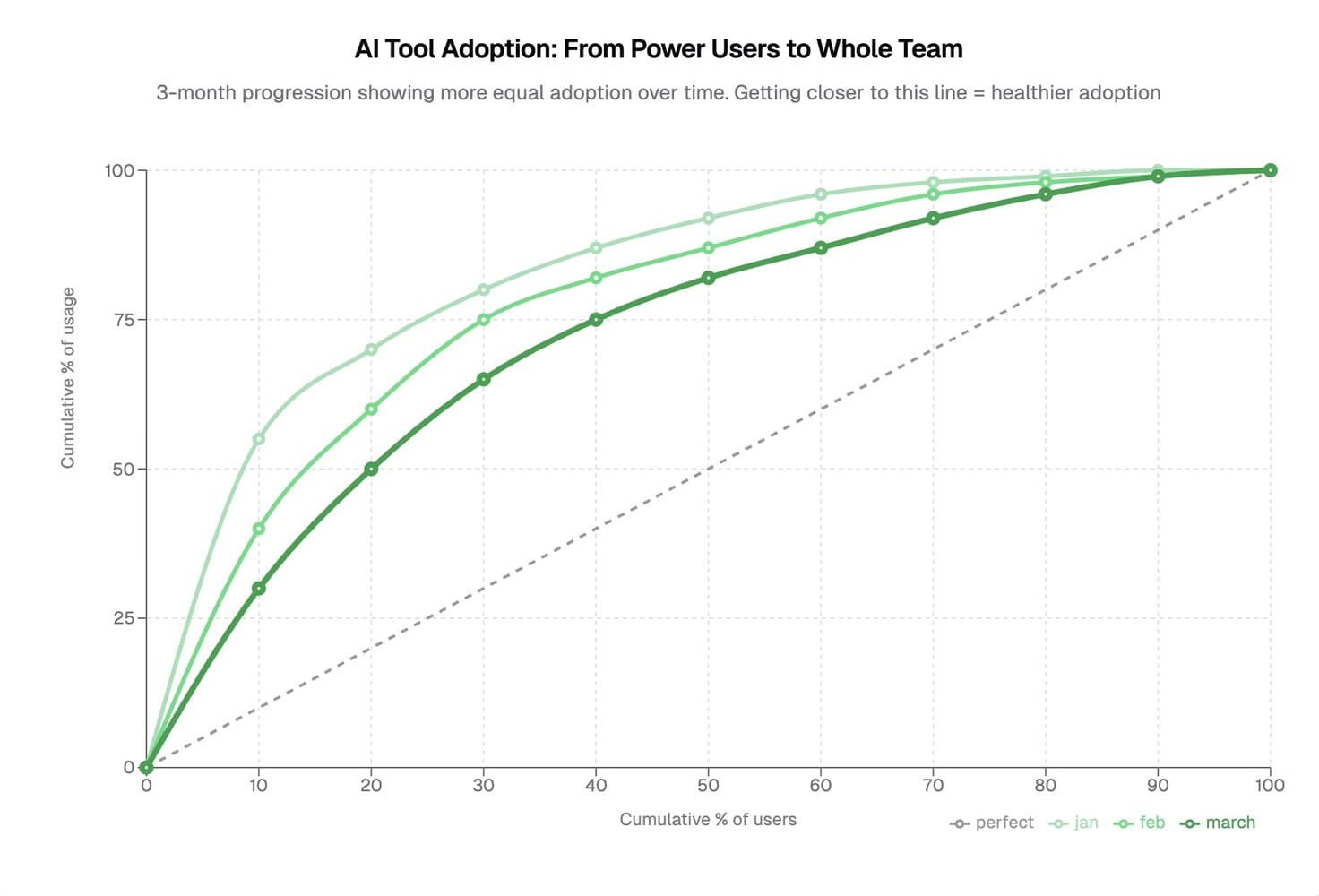
- A straight diagonal indicates evenly spread adoption - every engineer participates similarly.
- A sharp, steep curve highlights unequal usage - a small group of power users dominate, while most sit on the sidelines.
When we first rolled out internal AI assistants, our curve was steeply skewed - exactly as you’d expect early on. A few engineers embraced the tool wholeheartedly, driving up total usage. But the majority quietly lagged behind.
Month by month, we focused on gently flattening that curve. We improved onboarding, shared clear best practices, held internal demos, and provided targeted coaching. Gradually, adoption evened out. Without the Lorenz curve, we might have missed that shift entirely, mistaking early enthusiasm for lasting adoption.
Meaningful adoption isn’t just about totals - it’s about whether a new tool genuinely spreads throughout your organization.
Measure equality, not just enthusiasm.